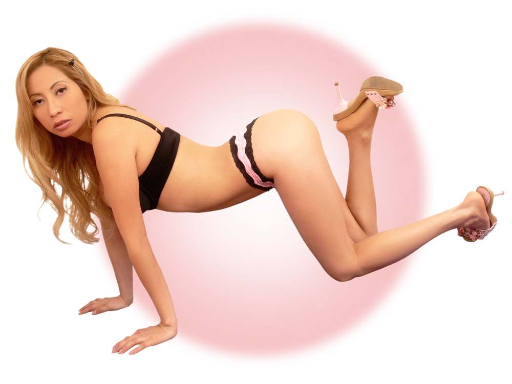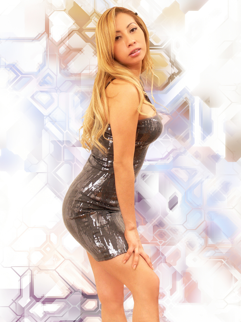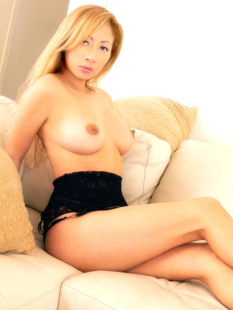




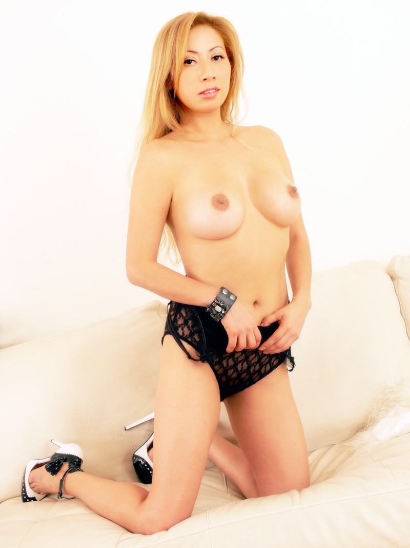
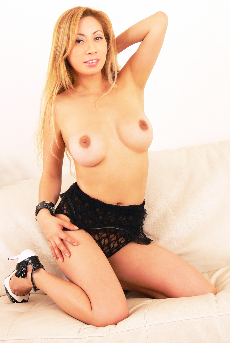
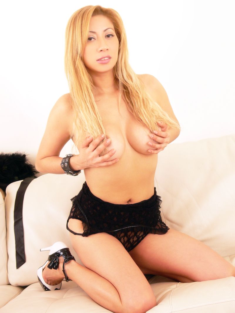
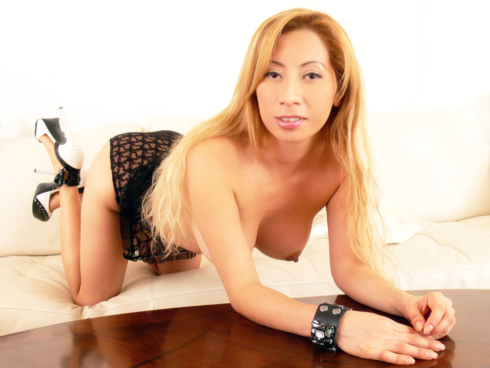
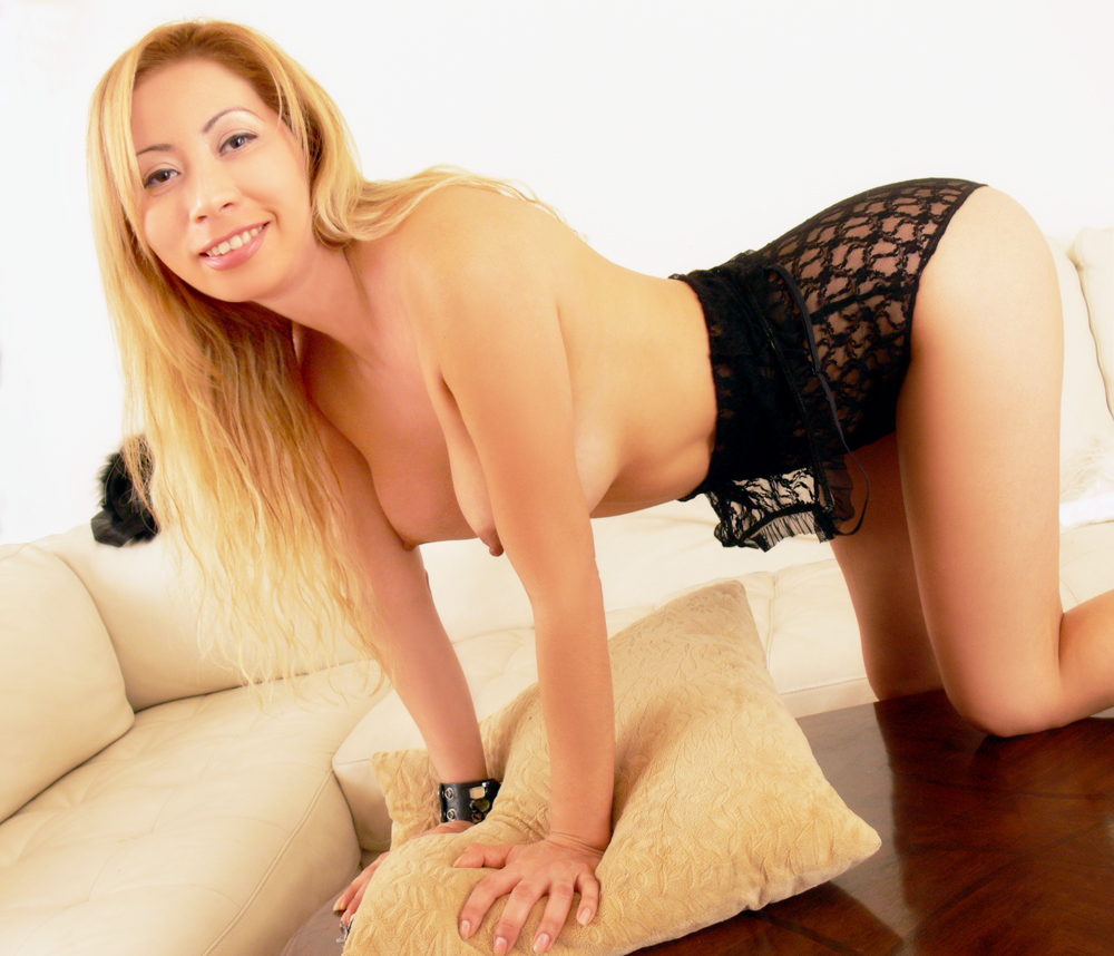
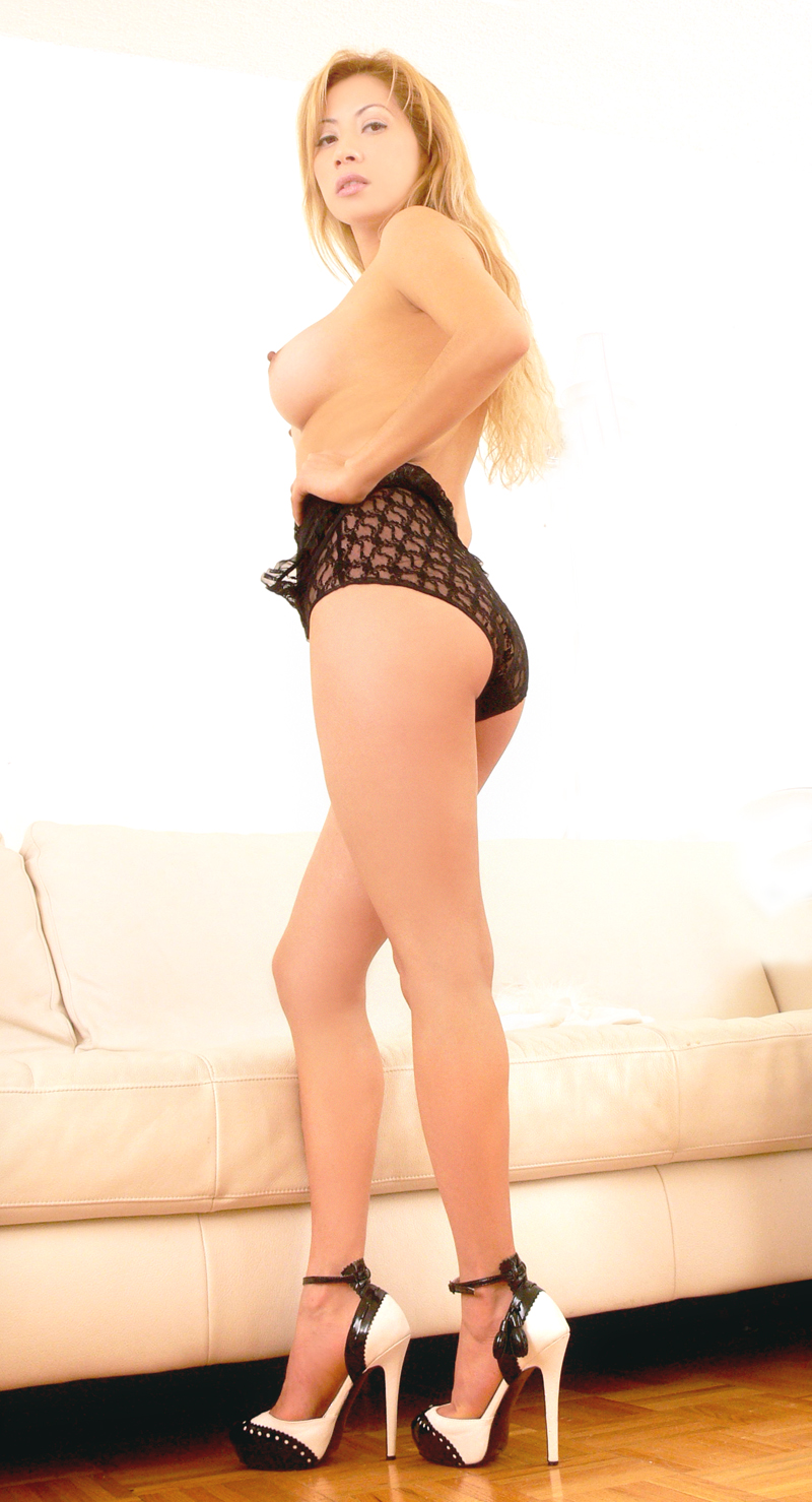
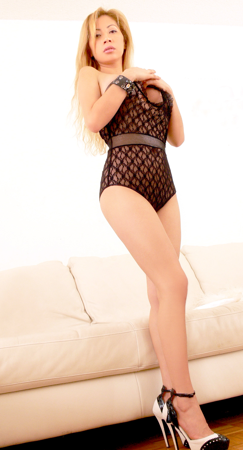
This first shot was really overexposed, did the best I could with it...
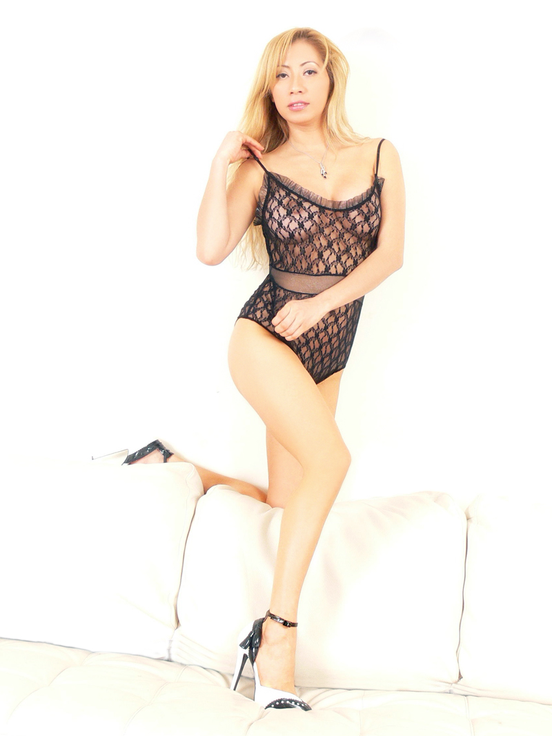
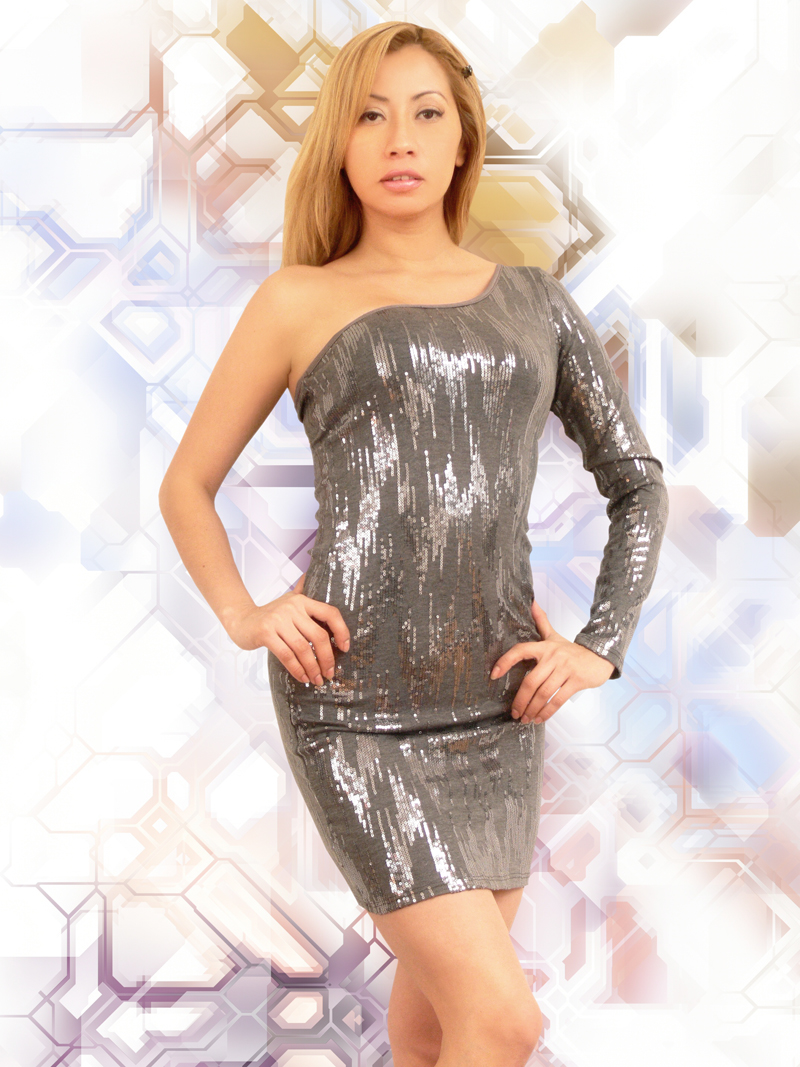
These next ones are pretty good....
First was a little soft focus on the face, but not too bad to work with....
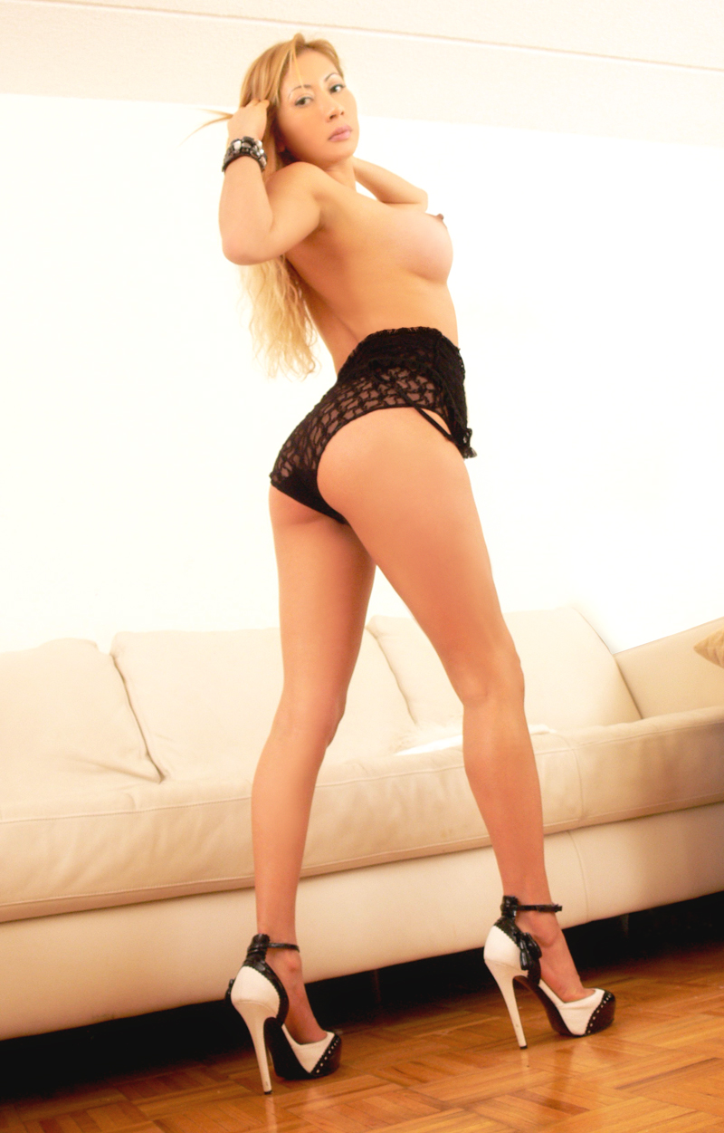
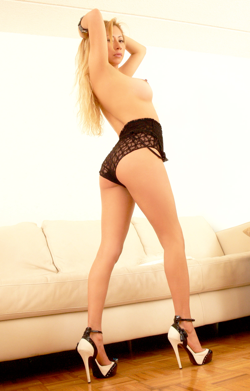
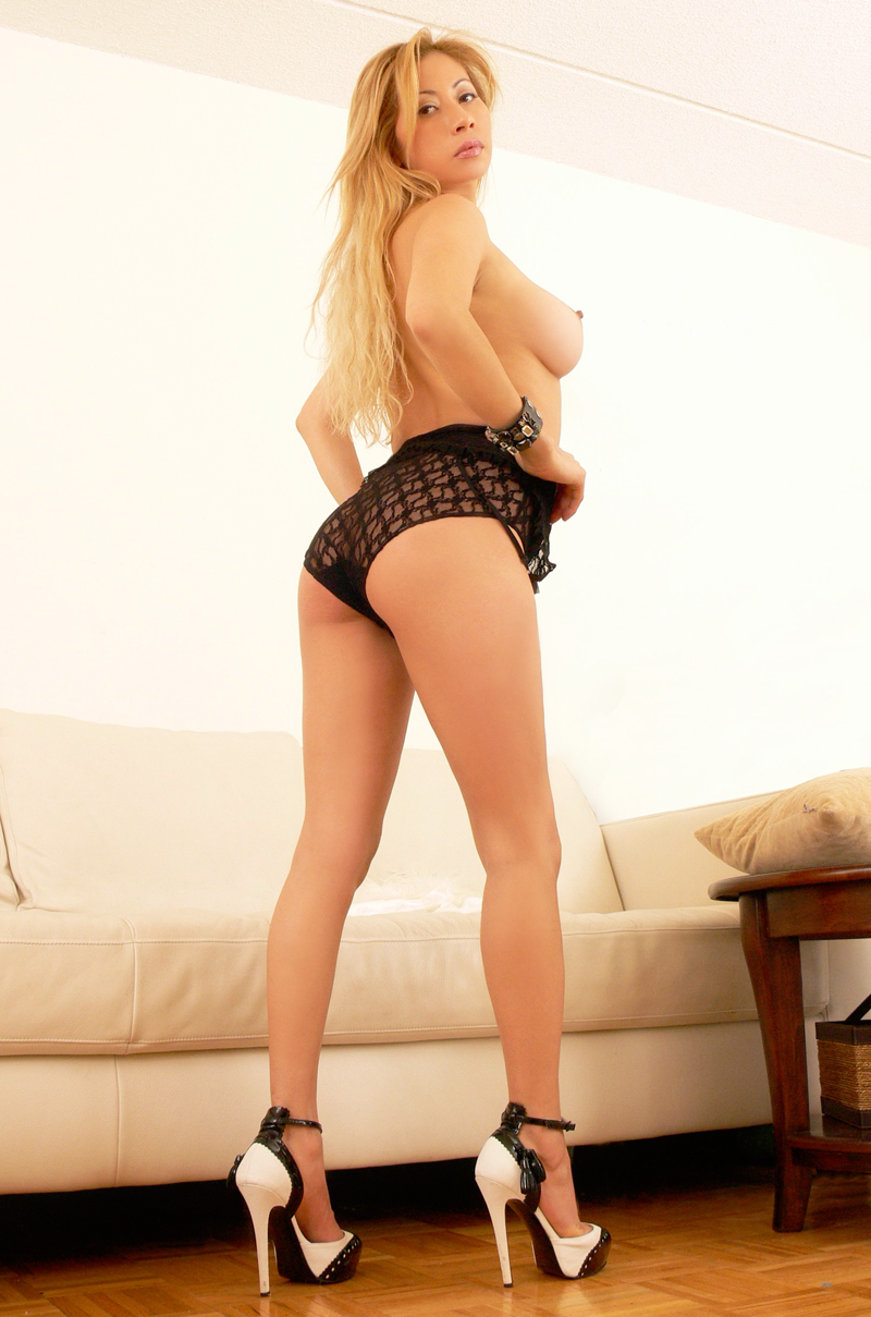
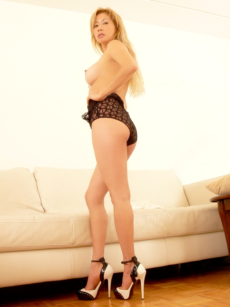
This one I really don't like. It was really overexposed on the face. Did the best I could.

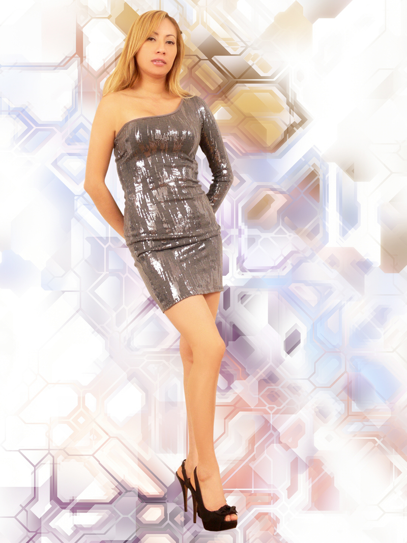
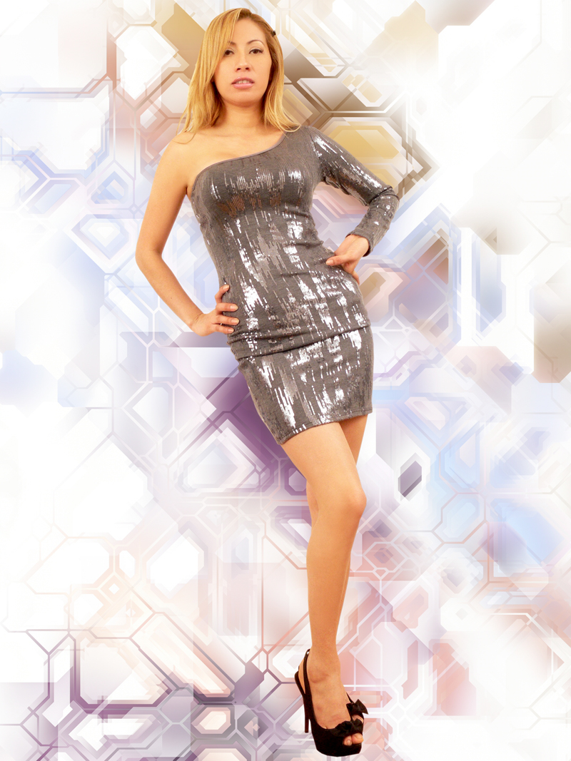
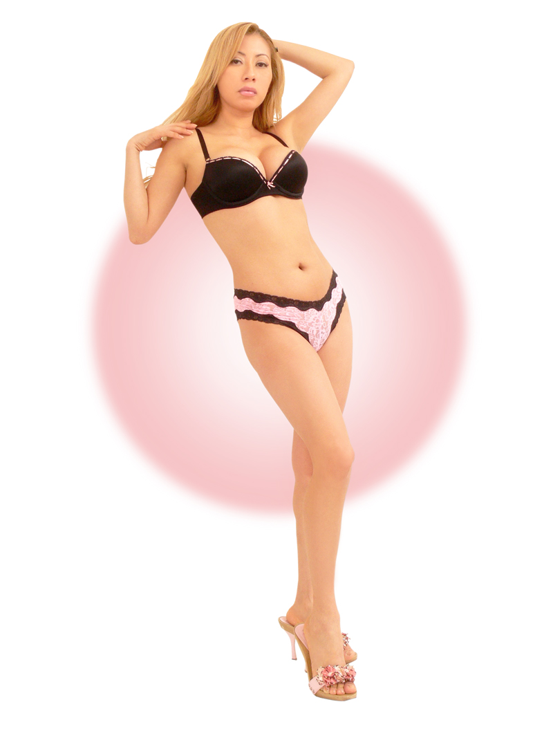
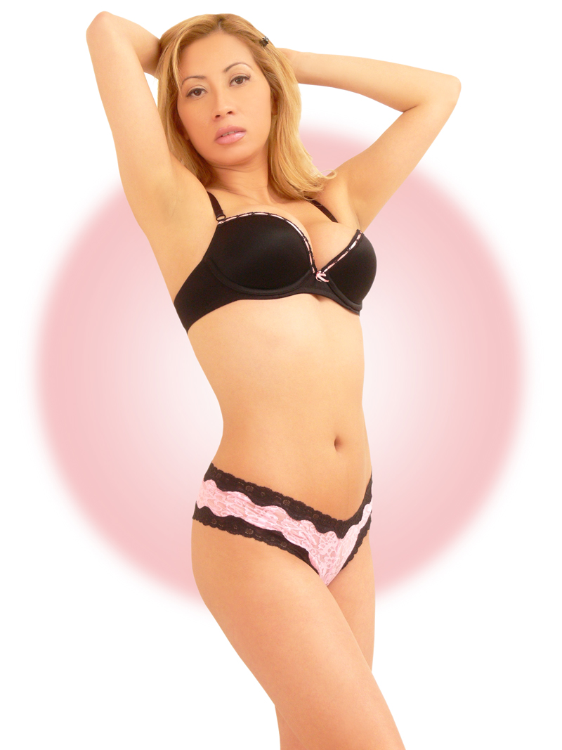
These next ones are the ones taken on the white wall with you standing on a
whitish sheet.
It allows me to do more, like changing the background.
Plus note how the light and color is more even from head to toe. That's
the result of the white floor under you.
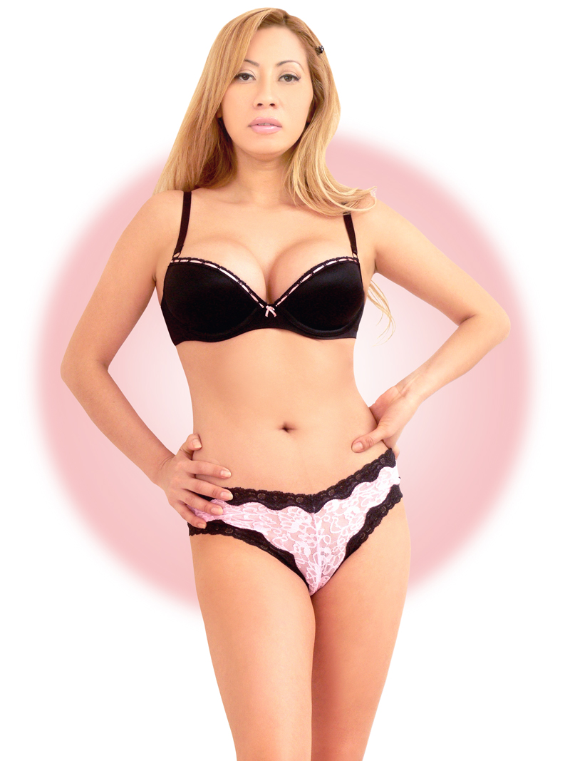
This one had the purple floor pad under you. You can see how the purple makes your underside facing the floor darker. A white sheet would have reflected light up on you. That said it's a pretty good shot anyway.
